Here is a list of the technologies I used as well as new things I learnt about them, things I found difficult and what we used it for.
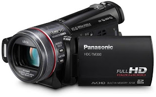
Panasonic HD DV camera

We used the Panasonic HD DV camera in order to film our music video. I used this camera in AS media therefore I knew how to use it. This was an advantage as some people were unsure of these new cameras. I really like the cameras because they are very light and compact as well as allowing us to produce some HD quality footage. The only issue I have with them is that if the settings have been changed by somebody else then at times it may be difficult to change back. At one point we had a problem with the exposure which we were unsure about how to change. However luckily this doesn't happen very often. We also noticed that because of the footage being HD the battery power didn't last very long. This caused us problems when we wanted to do a whole day of filming. However due to this restriction we worked out the best way to come around this was to film in blocks, so that it wasn't too tiring for the performer as well.
Canon EOS 450D DLSR camera
The canon EOS 450D DLSR camera was a very familiar technology for me being a photographer. I used this while doing my production of my DigiPak. Because of my familiarly I found it easy to produce good quality photos. I used manual settings which included the shutter speed, aperture, ISO and focus. I prefer to use all the manual settings so I have full control over my images and the final outcome.
Adobe Photoshop

I only really Photoshop during my DigiPak. Photoshop was the main programme I used that allowed me to achieve the full extent of my Digipak. For my Digipak you will see that I created a man in this glass box effect. This was a very difficult thing to produce and took many experiments and attempts in Photoshop. When creating my print work I wanted this 3d look of him being trapped in a glass box. This was a very complicated process and required me to do many things. First I opened the bottom image in this case a building (bottom left of my
digipak) and changed it to black and white by using the low saturation tool. I then opened the same image over the top and once again changed this to black and white. I did this so it allowed me to place glass filter over the top without completely wiping the previous picture. Once they were joined together with the glass filter over the top I then opened the image of our performer. Because this picture had a lot of extra imagery in it I needed to get rid of this. I used the eraser tool so that I could clear that layer wherever I wanted, allowing me to create his shape the way I wanted. I then once again put the glass filter over the top so that it looked liked he was in a box. I then selected the small area of his head using the lasso tool. I then selected the 3d tool and this allowed this part of his head to be detached and come over the top of all layers- creating the 3d look. It was a very long process but I think it looks very effective and works well. With the rest of the panels I did a very similar thing of erasing the area I didn't want so I could get the effect of him looking out onto the town.
Adobe Illustrator

I used adobe illustrator very frequently in order to experiment in creating a 3D box for my Digipak. I ended up creating the 3d box on Microsoft word and print screening this screen and edit in Photoshop, as illustrator proved to complicated for me to use.
Microsoft word

I used this piece of software when I was trying to create my box for my front cover of my Digipak. I struggled to make this 3d box in other software's so therefore felt it would be easier to create a box using insert shapes. and then screen shot it over the top of my background picture. Once I did that I had the picture saved in memory to allow me to open it in paint, save as JPEG and then opened in Photoshop.
Adobe Premiere Pro
Premiere Pro was the software that we used the most over this year. We used it mainly during our video production, as well as during the planning. We used Premiere Pro when learning about lip sync. We filmed a short video of us rapping Jay z and Rihanna and then edited the footage in Premiere Pro. We learnt how to match up the music to the words. However we found this task very easy because when we filmed it we were exactly in time.

When we moved onto the main task it got more and more difficult. We decided to undertake a rap, we thought at the time this was a good idea. But about 2 hours into the editing we realized it would be very difficult. We used the crop tool to allow us to cut our clips down so we didn't add unwanted footage. We didn't want to use too many special effects as we thought this was unnecessary when trying to portray a rap video. We did however use the black and white tool to change the coloring of the clip. We had to add this effect to each individual clip and then render it. This took a very long time considering we had about 100 shots. However once we did it , we didn't have to render it again which meant we weren't waiting around doing nothing. Other than the crop tool we didn't really use any other tools. Our video was made using simple techniques. The only problem we had when regarding our video and this software was that occasionally the sound would cut out (was something to do with the computer speed). this meant it was difficult to do the lip sync as we had to guess where the music was. This was incredibly annoying but we managed to cope and make our final product.
YouTube

YouTube was used when we were researching all the different videos that inspired us for our final video. It is a free site and easy to access so it was possible for us to undertake it. We also used it to publish our video at the different stages of production so we could get audience feedback from our target audience. this meant we could see and understand there opinions and learn how to improve the video. When we finished the final video we published it to YouTube. Doing this meant we could embed the video to our blog, and see the reviews of our target audience.
Facebook
Facebook a social networking site allowed us to connect to our target audience in a free and easy way. We made a Facebook group so we could upload posts, videos and any ideas to our audience and get feedback. this Facebook group is easy to make and was very reliable in allowing us to get the answers we wanted. We used Facebook to plan the video, so I could communicate with my partner, Megan Gorman. To get feedback while in the middle of our production and to get feedback once we had finished. Facebook is the new, free and quick way to connect to our audiences.
Blogger

Blogger was very useful in presenting my coursework. Its a free site and has allowed me to show my ideas and plans in an organised way. With this organisation it meant I could see easily what needed to be down and how to achieve it. It has also made it easy when trying to explain ideas to our performer. By showing him my blog he could understand what i wanted in a quick and easy way.
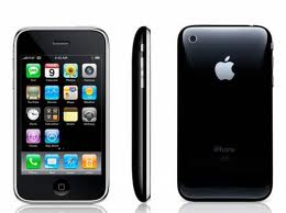
Iphone
We only really used an iPhone while we were out filming our video. We used the iPhone to play our song from which made it easier for our artist to rap along to. This portable device meant we could play it out loud (but not too loud to disrupt others) and in good quality so it was recognizable to the performer.
When planning for my video and digipak i used my iPhone. I connected up the calender from the computer to my phone so i could organize things on the go as well as see what we planned. This meant we were more organized. I also downloaded the blogger app so i could post blogs whenever and wherever I was to allow more freedom in completing the coursework.
Soundcloud
Soundcloud is an online website that allows artists to post their music for free and get it listened to anybody. We found our artist through a friend who referred us to Soundcloud. This site allowed us to listen to all of his music and learn about him before even meeting him. We didn't really use Soundcloud after that as we had the original mp3 to play the music.


 I used the font STENCIL for the titles and the main focus points. This font looked like the font you would find sprayed onto a graffiti wall which added to the urban idea and street feel. The font was slightly different on the inside panel (named : Mv Boli) because I wanted to create the look as if he was saying it. I though it was appropriate to change the font so that it added something different to the pack. This font was then used on the smaller writing of copyright, (found on the CD and the bottom of the back panel). Throughout the promotional package the main colours used were: Black, Grey, Red and Yellow.
 Despite my digipak being a little entropic (a man in a glass box) i think it still relates because of the scenery being an urban town. I wanted my digipak and advert to be more creative and entropic. The Eminem album cover of Recovery inspired me. His video also being set in the streets didn't involve him in a glass box in the centre of town. I thought this would work well. I made sure the same clothes were being worn however in order to make an resemblance. It would have been very difficult to create this idea on our music video at the low budget we had. If we had a bigger budget and more professional equipment/knowledge it would have been easier to produce. But i still think that my package relates in its own way.
 I originally throughout of doing my package in the studio however we decided in the end when we were producing our music video that natural lighting would be best to show of our street themed. We thought it would have given off a different vibe if we had set up these power lights. All of my promotional package has natural lighting, which despite making it look low budgeted adds to the street theme and matches the darkness of rap music. However we decided to challenge this at the end of our music video by changing the brightness on the camera as we thought the extreme brightness matched the slow downed music towards the end. We thought it was a good ending to our final music video.


